
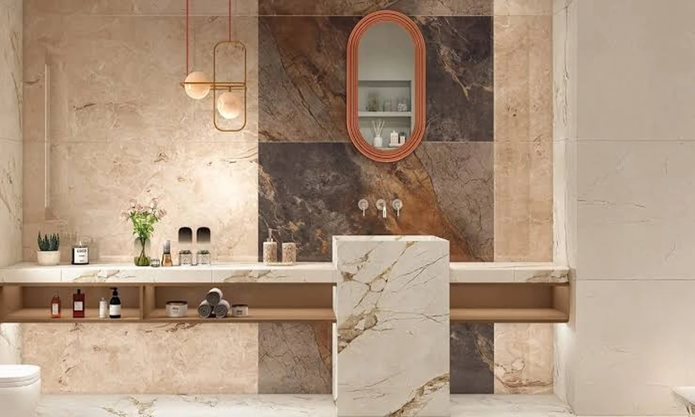
A couple I know renovated their main bathroom last year and could not agree on the walls. She wanted big, seamless panels of tile for a clean, modern look. He was drawn to mosaic, the small tiles that add texture and detail. Rather than fight about it, they did something smart: large-format tile on the main walls, mosaic on a single feature wall behind the vanity. Living with both in the same room taught them more than any showroom could.
The first surprise: installation is a different sport
Large-format wall tile looks effortless on a finished wall, but getting there is demanding. Each piece is big and heavy, which means the wall behind it has to be genuinely flat. Any bump or dip shows up as a lippage between panels, where one edge sits proud of the next. Their installer spent as much time prepping and flattening the substrate as laying the tile itself.
The mosaic wall was the opposite. Mounted on mesh sheets, the small tiles flexed to follow slight imperfections in the wall, forgiving the kind of unevenness that would have ruined a large-format install. But mosaic brings its own tax: grout lines, and lots of them. When they went to compare products and click here through the wall tile options, the trade-off became obvious on paper before it did on the wall. Fewer, larger pieces versus many small ones, each with consequences down the line.
Grout: the detail that decides maintenance
This is where daily life entered the equation. The large-format wall has almost no grout. A few thin lines, easy to wipe, nothing that traps soap scum or grows grime. Months later, it still cleans with a single pass of a cloth. For a shower surround especially, that lack of grout is a real, ongoing advantage.
The mosaic feature wall is the high-maintenance member of the household. All those grout lines look stunning, but they collect residue and need more attention to stay crisp. Because it sits behind the vanity rather than in the wet zone of the shower, the upkeep stays manageable. Had they put mosaic in the shower itself, the story would read differently. Location, they learned, changes everything about mosaic.
How each one changed the feel of the space
Visually, the two approaches do opposite things to a room. The large-format walls made the bathroom feel bigger and calmer. With few visible seams, the eye glides across the surface without interruption, and the space reads as more expansive than its actual square footage. In a compact bathroom, that stretching effect is worth a lot.
The mosaic wall does the reverse, and on purpose. It pulls the eye, adds depth, and creates a focal point that a flat expanse never could. As an accent, it gives the room personality. As an all-over treatment, though, it would have made the small bathroom feel busier and tighter. The lesson landed clearly: mosaic shines as a deliberate accent, not as wallpaper.
The cost picture nobody mentions upfront
On material price alone, the comparison is murky. Premium large-format tiles can cost more per square foot than basic mosaic, or the reverse, depending on the lines you choose. The real cost divergence is labor. Large-format demands precise substrate prep and careful handling, which adds installer hours. Mosaic goes up faster in awkward spots but multiplies grouting time.
In their project, the large-format walls cost more to install per square foot, while the small mosaic accent, being a limited area, stayed affordable despite its fussier finishing. The takeaway for anyone budgeting: do not compare tile by the sticker price alone. Factor in the wall prep, the handling, and the grouting, because those hidden hours often outweigh the difference in the tile itself.
The lighting detail that surprised them
One thing they did not anticipate was how differently the two walls behaved under light. The large-format tile, with its smooth continuous surface, reflected the bathroom lighting evenly and made the room feel brighter. Fewer seams meant fewer shadow lines to break up the reflection. In a room with a single window, that extra bounce of light was a genuine, if accidental, benefit.
The mosaic wall did something more theatrical. Its many small facets and recessed grout lines caught the light at different angles, creating subtle texture and depth that shifted as you moved through the room. In the evening, with softer lighting, that texture became a feature, giving the wall a tactile richness the flat panels could not match. It was a reminder that a tiled surface is never just a color, it is a way of handling light.
This changed how they thought about placement. The large-format walls earned their spot in the areas where brightness and openness mattered most. The mosaic earned its spot precisely where a bit of drama and shadow added interest, behind the vanity where the eye naturally lingers. Had they reversed the two, the room would have lost both advantages at once. The interaction between tile and light, they realized, is a design tool in its own right, and one that rarely gets mentioned when people argue about formats.
What they would tell you to do
Their conclusion was not that one tile beat the other. It was that each belongs in a specific role. Use large-format on the big surfaces where you want calm, seamless, low-maintenance walls, particularly in wet zones where grout is a liability. Reserve mosaic for a feature area where its texture and detail earn their keep and its maintenance stays contained.
Mixing the two, it turned out, gave them the best of both. A serene, easy-clean backdrop with one wall of character that makes the whole room feel designed rather than tiled. If they had committed fully to either option, they would have gained its strength and inherited its weakness across the entire space.
The broader point applies to any wall you are about to tile. Ask what the surface needs to do first, then choose the format that serves that job. Looks matter, but installation demands, maintenance, and how the tile shapes the sense of space matter just as much. A bathroom that gets this right feels effortless for years. One that chooses on looks alone often pays for it every time it needs cleaning.
The couple’s split-wall experiment ended up teaching a lesson that applies well beyond tile. In renovation, the instinct to pick one solution and apply it everywhere is often the wrong one. Different surfaces in the same room do different jobs, and matching each to the format that serves it best usually beats forcing a single choice across the whole space. Their bathroom works precisely because they let each wall do what it does best, rather than making one material carry the entire room.